Enhance Photographs With Complimentary Colors in Photoshop

In this photo editing tutorial, we show you how you can use complimentary colors to make your photograph visually attractive.
first we need to find which is the best color combination to apply color theory. To find complementary colors i got this color wheel from google search but there are plenty of other places to find great color wheels as well. You will find them on opposite sides of the color wheel from each other. If you want to use more than three colors, it is called a color triad. you see a triangle in the image helps to find complementary three colors.
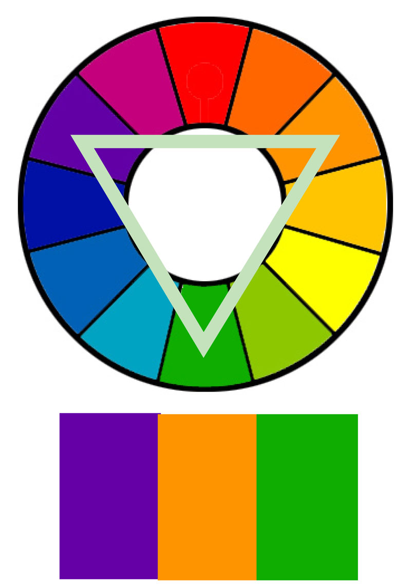
Complementary Color Wheel
Now i need to select colors for highlights and shadows. Now select foreground color to replace and select orange color.
Now swatch Background and select blue color.
open photograph & apply color theory to Image, add solid color adjustment layer.
For this, i want the blue to only affect the dark areas of the image.
To do that, double click on the layer to get the layer options panel.
The important slider here is Underlying Layer. Drag the white triangles to the left and you will see that the blue starts to only affect the shadows.
Hold Option or Alt Key clicking on the triangles splits them so you can feather the blending effect.
Change solid layer from normal to the softlight blend mode.
Now do the same for the highlights. This time, however, we want to preserve the highlights so drag the black triangles to the right.
Once again, split them to feather the blend.
we added two complementary colors, one called shadows which is blue and the other called highlights which is orange. Opposite colors work so well with each other visually.
Don’t be afraid to lower the opacity of the colors, because they will likely come out extremely bright and over the top. Reduce highlight layer opacity to half, it match best with shadows in that range.
We can try other color combination also. simply use the eyedropper or brush tool to sample the color from the reference image. This time i choose yellow and purple.
To change the solid color, simply click directly on the color swatch, then choose a new color from the Color Picker.
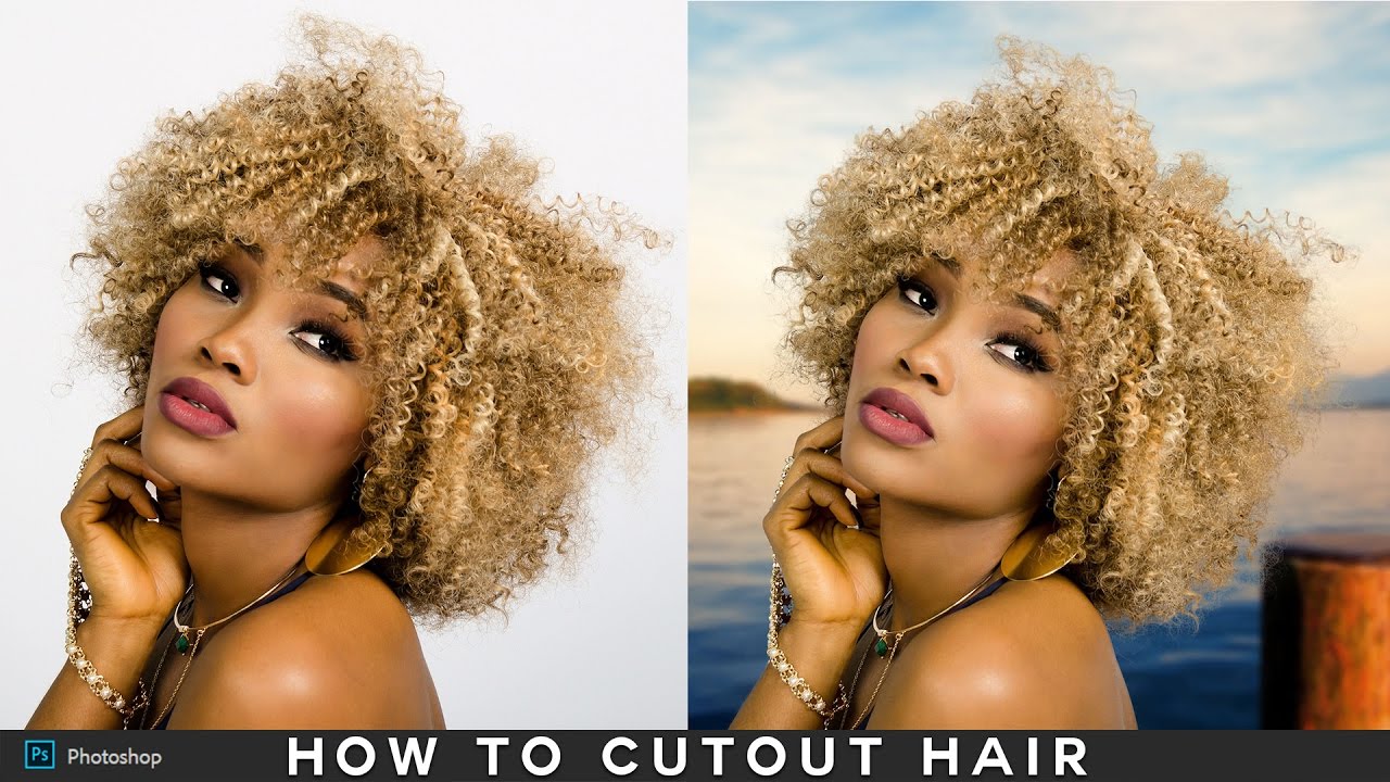
here is before and after


The idea behind Color Theory is to use complementary colors because they work so well with each other visually.
[sociallocker id=”1411″][download-attachments][/sociallocker]


Bro Please Tell me how to make your website Please please