Color Burn and Dodge Blending for Photos in Photoshop

Learn how to use Color Burn and Dodge in photoshop. Today I’m going to share with you two powerful blend modes that you can use together to create amazing color contrasts in your images in Photoshop.
Color Burn and Dodge Blending for Photos in Photoshop Tutorial:
►Sample Image for Practice: CLICK HERE
So first, let’s create a hue/saturation adjustment layer. To do this, just click on the adjustment layer icon and select “hue/saturation”. Don’t change anything for now.
Next, change the blend mode from “normal” to “color burn”. This blend mode is part of the darken group and it darkens the image. As you can see, when we change to color burn, the image goes crazy.
But, if you decrease the opacity, it makes the image more transparent. On the other hand, if you increase the opacity, the image becomes more opaque. The opacity control doesn’t really change the projection of the blend mode, but if you reduce the fill, you’ll see that it changes the projection.
Let’s keep the fill at around 9. Now, let’s create another hue/saturation adjustment layer. This time, change the blend mode to “color dodge”. “Color burn” darkens the image and adds color to the dark areas, while “color dodge” brightens the image and adds color to the bright areas.
The combination of these two blend modes is truly amazing. If you decrease the fill opacity, it won’t help, but if you adjust the fill, it controls the projection. Let’s keep the fill at 7.
Now, we have a beautiful colorful contrast in our image. Since we added a hue/saturation adjustment layer, why not have some fun with it? Double-click on the adjustment layer icon and increase the saturation.
Wow! Just look at the colors of the highlights when the saturation is all the way to the right. It’s amazing! And you can do the same with the shadows. If you increase the saturation, the shadows will become very colorful.
On the other hand, if you decrease the saturation, the color won’t pop as much, but if you increase it all the way to the right, the shadows will be very vibrant. Let’s decrease the fill to 7.
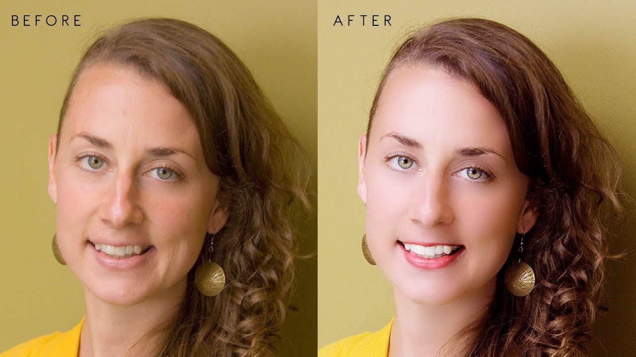
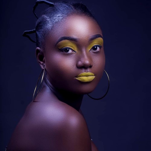
And there you have it! Here’s the before and here’s the after. That’s how you can make the colors pop and increase the contrast with colors in Photoshop using a combination of two special blend modes, “color burn” and “color dodge”, and by playing with the saturation using a hue/saturation adjustment layer.
I hope this tutorial helped you. If it did, make sure to like it and don’t forget to subscribe and hit the bell so that you don’t miss any other feature, tip, trick, or tutorial. Thank you so much for watching. I’ll see you in my next one. Until then, stay tuned and take care.
►SUBSCRIBE to my YouTube Channel: CLICK HERE
►JOIN or Become YouTube Member for Direct Downloads: CLICK HERE
►Support Me on Patreon for Instant Downloads: CLICK HERE