Create High Contrast Black and White Images in Photoshop

In this video, today we are going to learn how to create high-contrast black and white photos in Photoshop. Learn the use of gradient maps and how it works with details instructions in this method. Also, compare desaturate commands with gradient maps and understand the difference between them to make an awesome black-and-white photo.
High Contrast Black and White in Adobe Photoshop Lightroom Tutorial:
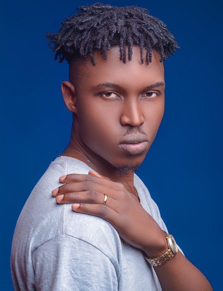
Both Gradient Maps and the Desaturate command are fast and easy to use, so let’s see which one is better at converting an image to black and white. We’ll start with Desaturate. In the Layers panel, the image appears on the Background layer. I’ll make a copy of it by dragging it down onto the New Layer icon. Then I’ll double-click on the copy’s name and I’ll rename it Desaturate. Then to desaturate the image, I’ll go up to the Image menu, down to Adjustments, and I’ll choose Desaturate. And Photoshop instantly removes the color, leaving it in black and white. But the result is not that impressive. There are no dark shadows or bright highlights to give it that high contrast look we’d expect from a great black and white image. Instead, it just looks like what it is an image with no color.
So let’s compare this to what we get using a Gradient Map. I’ll turn the Desaturated layer off by clicking its visibility icon. Now before adding a Gradient Map, check in the toolbar to make sure your Foreground and Background
colors are set to the defaults, with black for the Foreground and white for the Background. The reason is that by default, Gradient Maps use a gradient based on these colors. So if yours are set to something other than black and white, click the small Reset icon above them. Or press the letter D (for Defaults) on your keyboard. Then back in the Layers panel, add a Gradient Map by clicking the New Adjustment Layer icon and choosing a Gradient Map adjustment layer from the list. The Gradient Map appears above the image, and this time we get a much higher contrast black and white
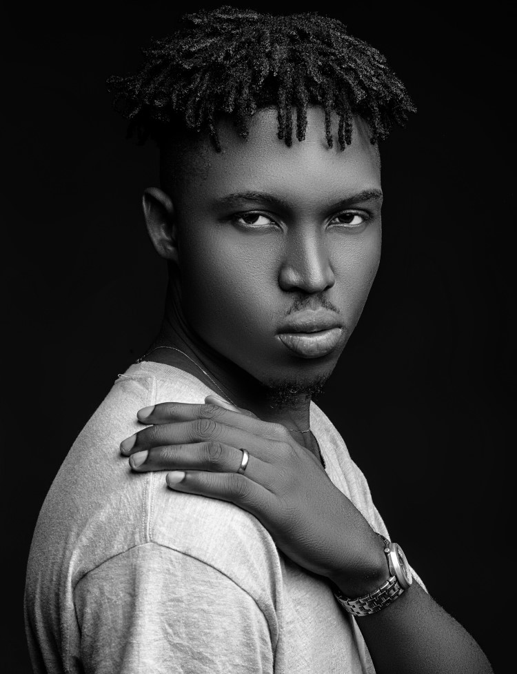
version, with darker shadows, brighter highlights, and better overall detail. If we look at the desaturated version again and compare it to the Gradient Map, it’s easy to see which one is better even though they both took about the same amount of time. The higher contrast from the Gradient Map really helps the image pop, with more detail
in his face and in his hair, and more obvious texture in his shirt and in the background.
That’s how easy it is to turn photos to high contrast black and white using a Gradient Map in Photoshop. If you found this video helpful, don’t forget to click the Like button and Subscribe to my channel for more videos.
►Download This Tutorial Photo for Practice: CLICK HERE
►SUBSCRIBE to my YouTube Channel: CLICK HERE
►JOIN or Become YouTube Member for Direct Downloads: CLICK HERE
►Support Me on Patreon for Instant Downloads: CLICK HERE